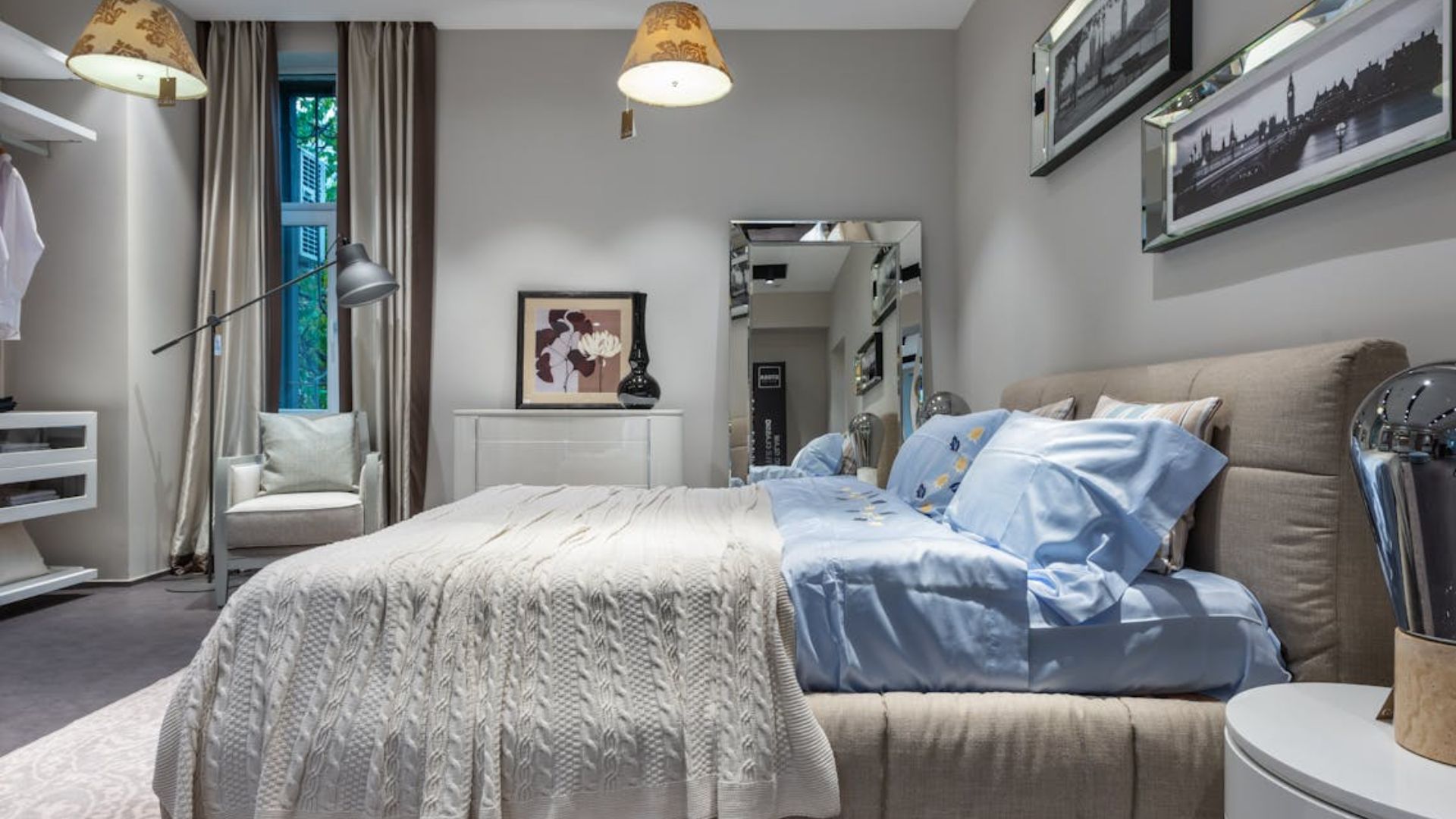
Paint color sets the entire tone of a space. The right pairing creates mood and flow without saying a word. They also bring depth, cohesion, and personality to any project. However, when two shades don’t complement each other, even a well-designed room can feel disjointed or overwhelming. That’s why smart color combinations are a vital part of any design finish.
In this roundup, you’ll discover seven of the most reliable and visually striking paint pairings, plus seven color clashes that tend to derail even thoughtful designs. Use these examples as both inspiration and caution because every design should reflect the best of what color can do.
Soft Sage And Warm White

Soft sage sets a peaceful tone, making it ideal for bedrooms or quiet corners. Warm white tones keep the space light and prevent it from feeling too muted. Together, they create a fresh yet familiar look. Add linen drapes or wood accents to complete the calm, grounded vibe.
Navy And Blush Pink
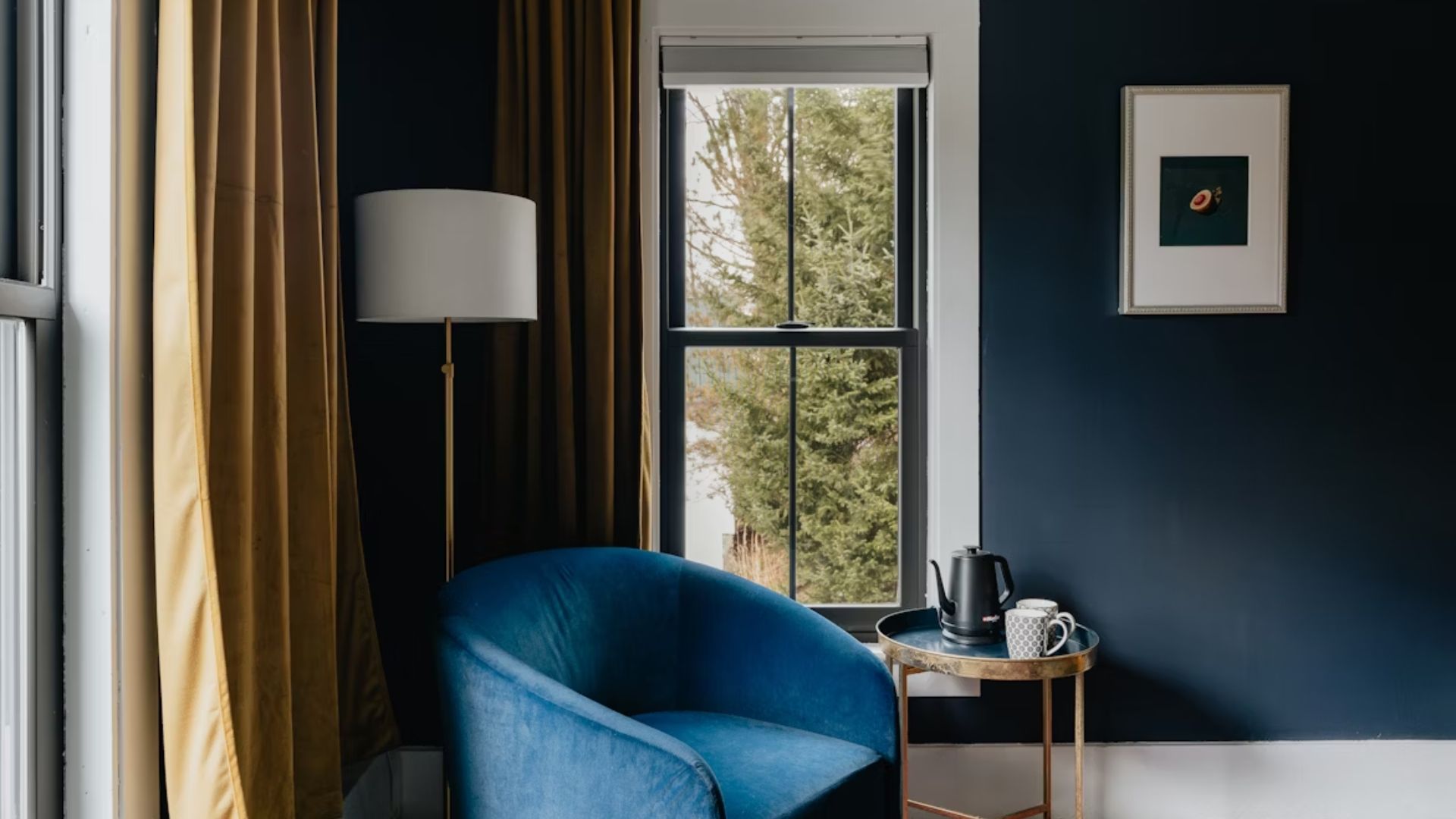
Bold yet balanced, navy brings drama, while blush pink softens the scene with subtle charm. This combination feels fresh, especially in contemporary spaces. Think elegant home offices or statement living rooms. The mix of strength and softness keeps the look both stylish and inviting.
Charcoal And Mustard
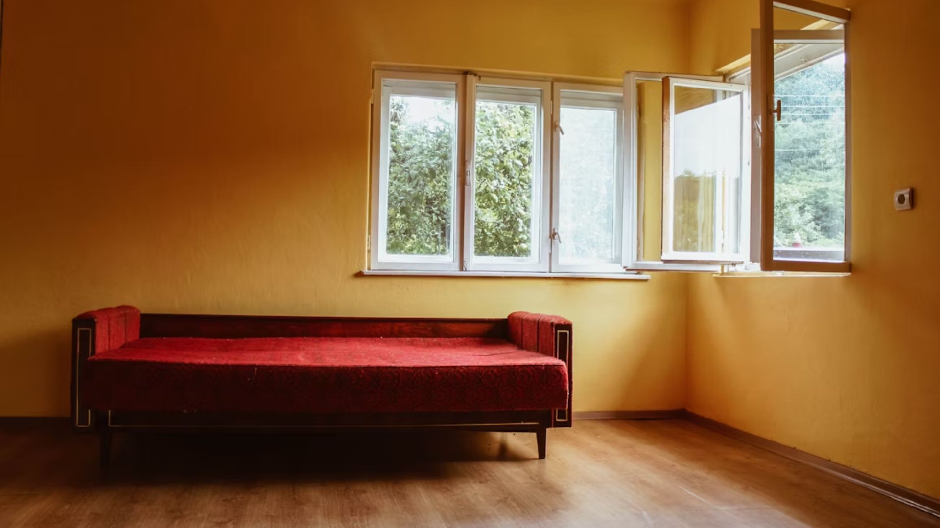
Use this pair in lounge areas or entryways for maximum impact. Charcoal acts as a dramatic backdrop that gives mustard a vibrant stage to shine. The pairing is striking and ideal for those who want their space to feel confident and curated. Gold hardware or black fixtures blend in perfectly.
Terracotta And Cream
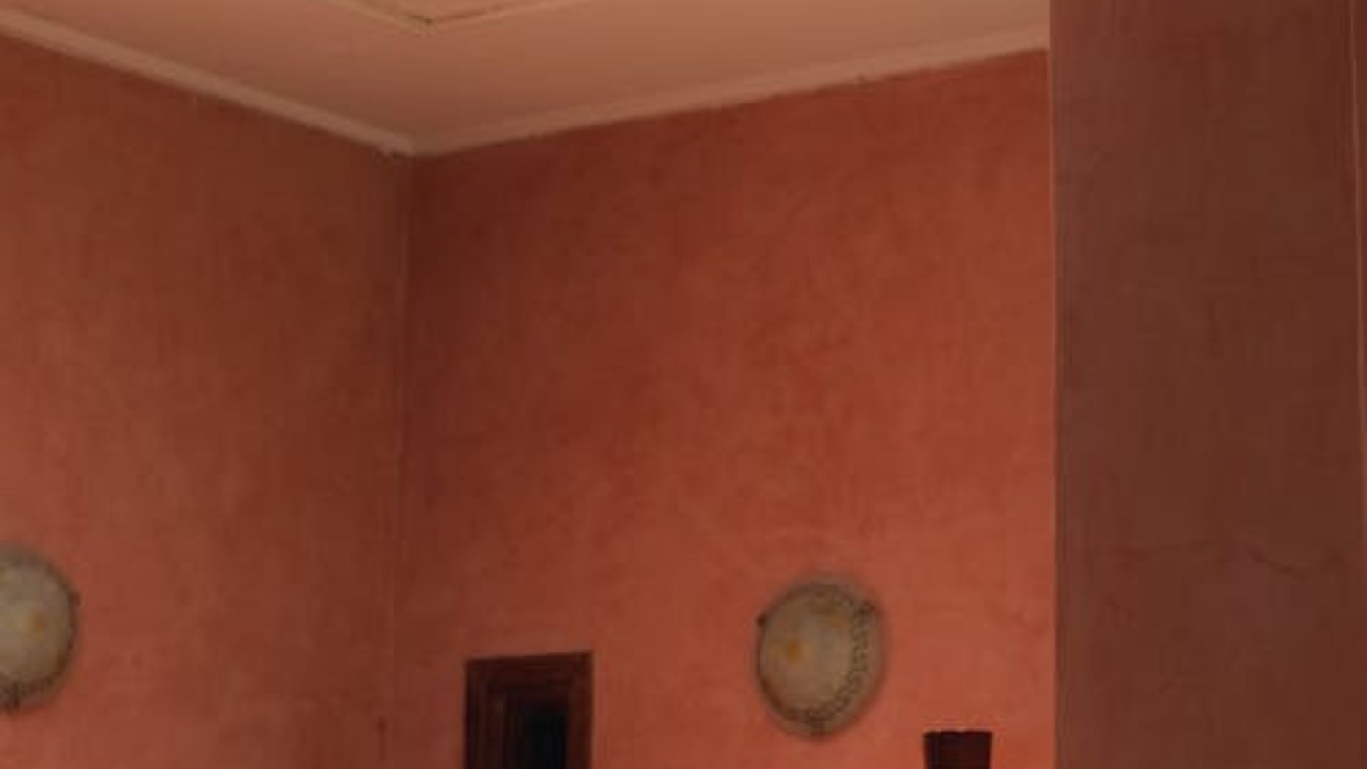
While terracotta brings an instant sense of warmth, like sunbaked clay walls in a Mediterranean kitchen, cream steps in to soften the look and keep things airy. You can add pottery, woven rugs, or rattan for a finish that feels handmade and homey. The effect is cozy but never heavy.
Dusty Blue And Light Gray
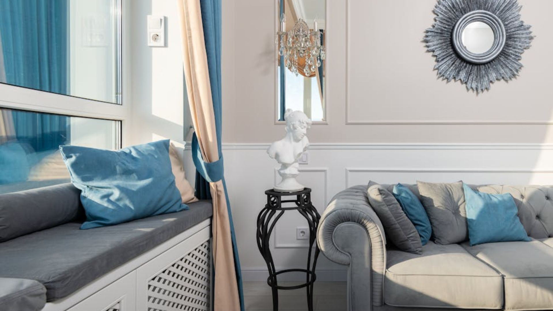
This combo is a natural fit for spa-like bathrooms or guest rooms. Cool and collected, dusty blue offers a restful backdrop that feels effortlessly serene. Light gray doesn’t compete—it enhances the stillness with quiet neutrality. The result? Calm without looking cold, elegant without being stiff.
Forest Green And Brass Accents
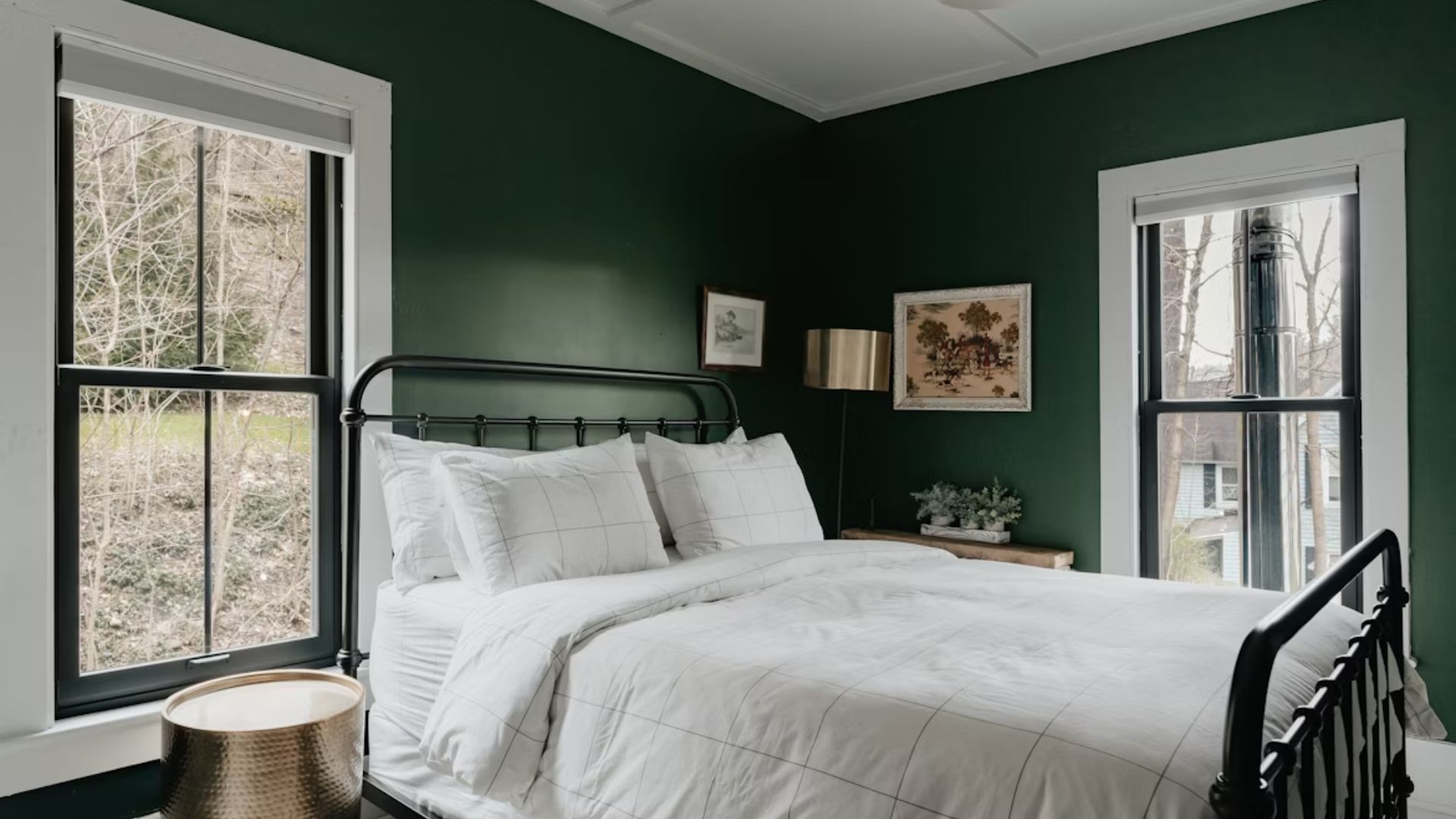
There’s something quietly dramatic about forest green. It commands attention without raising its voice. Brass accents bring a gleam that offsets the depth with a touch of luxury. The duo thrives in rooms that benefit from richness and mood. Layer in velvet or dark wood for even more texture.
Black And Soft Taupe
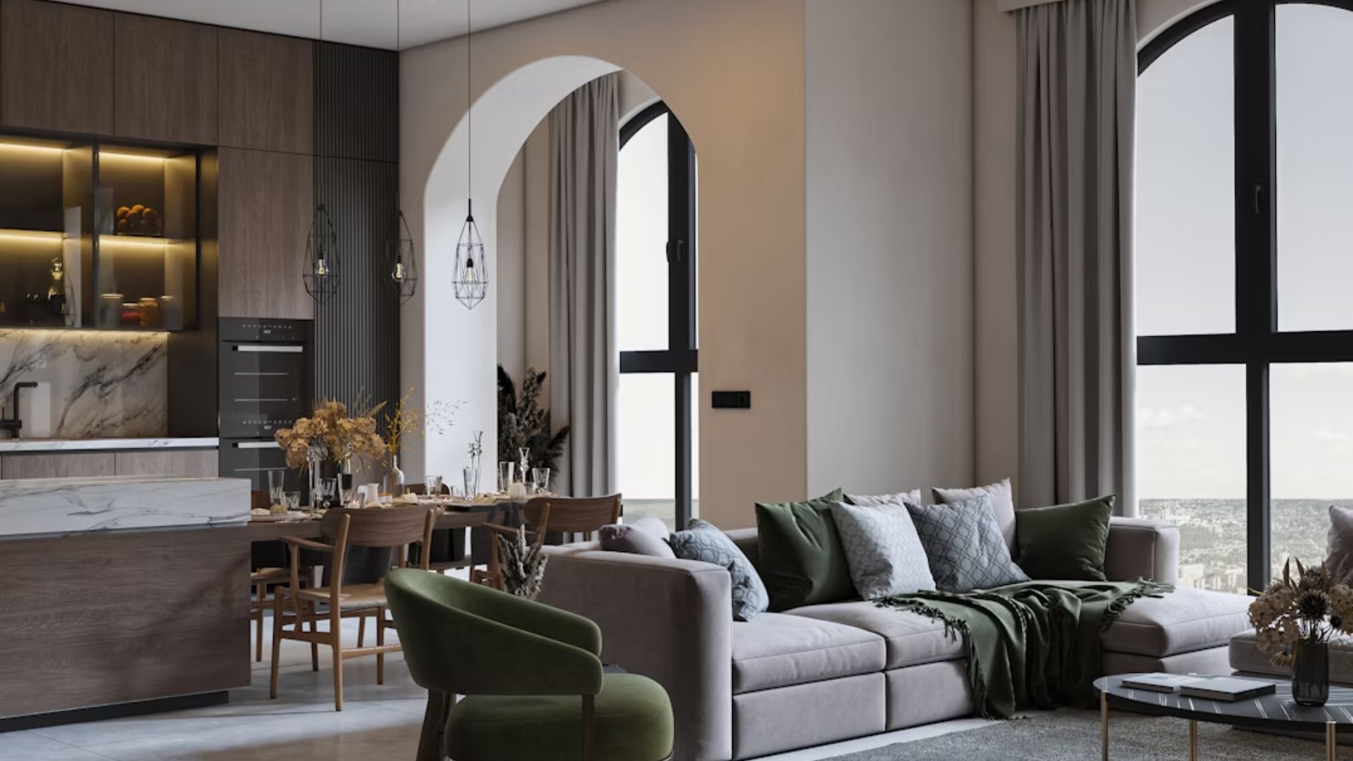
Few color pairings feel as refined as this one. Black introduces graphic clarity, while soft taupe softens the edges just enough to make it feel grounded. It’s minimalism with warmth—not stark, just clean, and is ideal for modern bedrooms or sleek living spaces where simplicity is the goal.
Neon Green And Burgundy
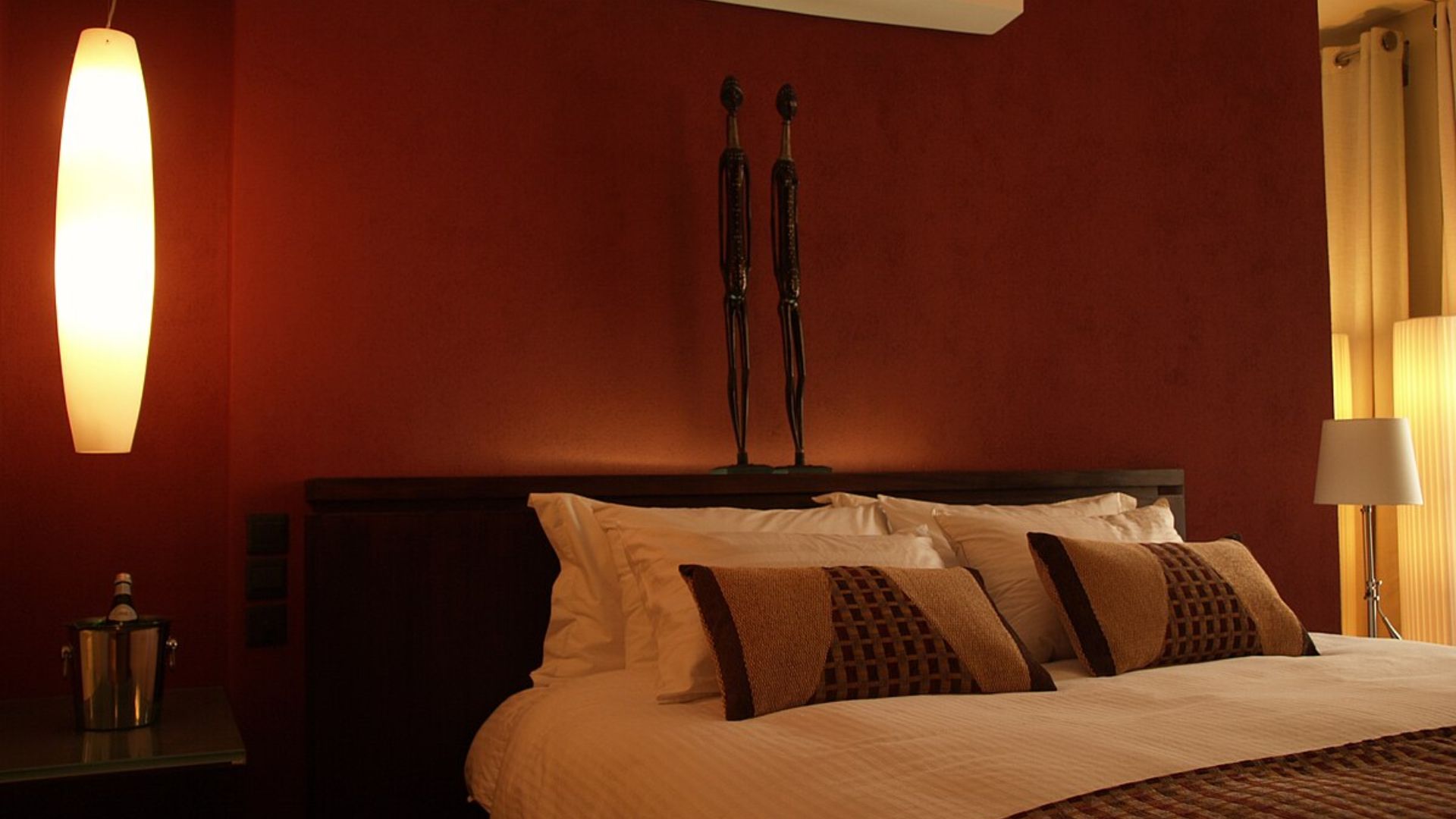
For color pairings that clash more than they blend, let’s start with this duo. Though burgundy might try to steady the palette, neon green quickly hijacks the scene. The imbalance is immediate, and the intense brightness overshadows any chance of harmony. Rather than working together, the colors seem to compete for dominance.
Bright Orange And Purple
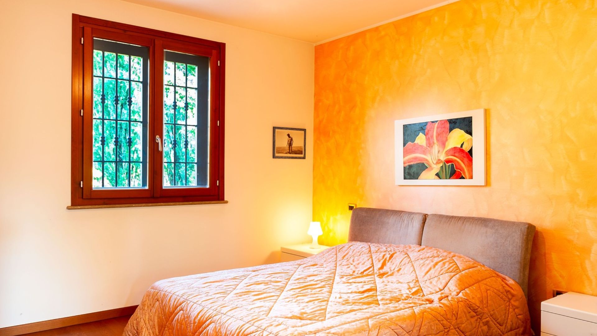
When these colors scream, neither gets heard. Bright orange is energetic, and purple is bold, but together, they clash more than complement. Also, there’s no visual pause and no resting point for the eyes. Unless the goal is deliberate chaos, this pairing tends to overwhelm rather than inspire.
Red And Lime Green
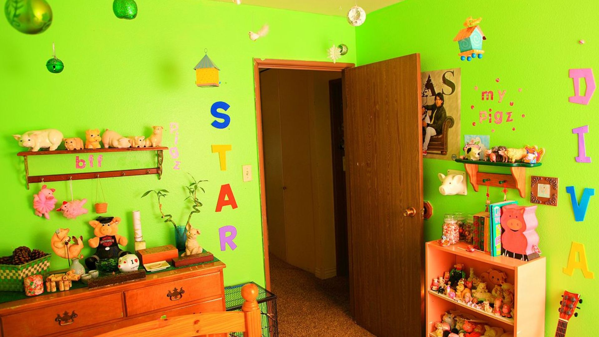
At first glance, this combo feels festive, but not in a good way. The saturated contrast pulls hard on the eye, instantly recalling holiday kitsch. There’s little nuance here; just two extremes battling for relevance. In most interiors, it’s a mismatch that feels out of season year-round.
Yellow And Hot Pink
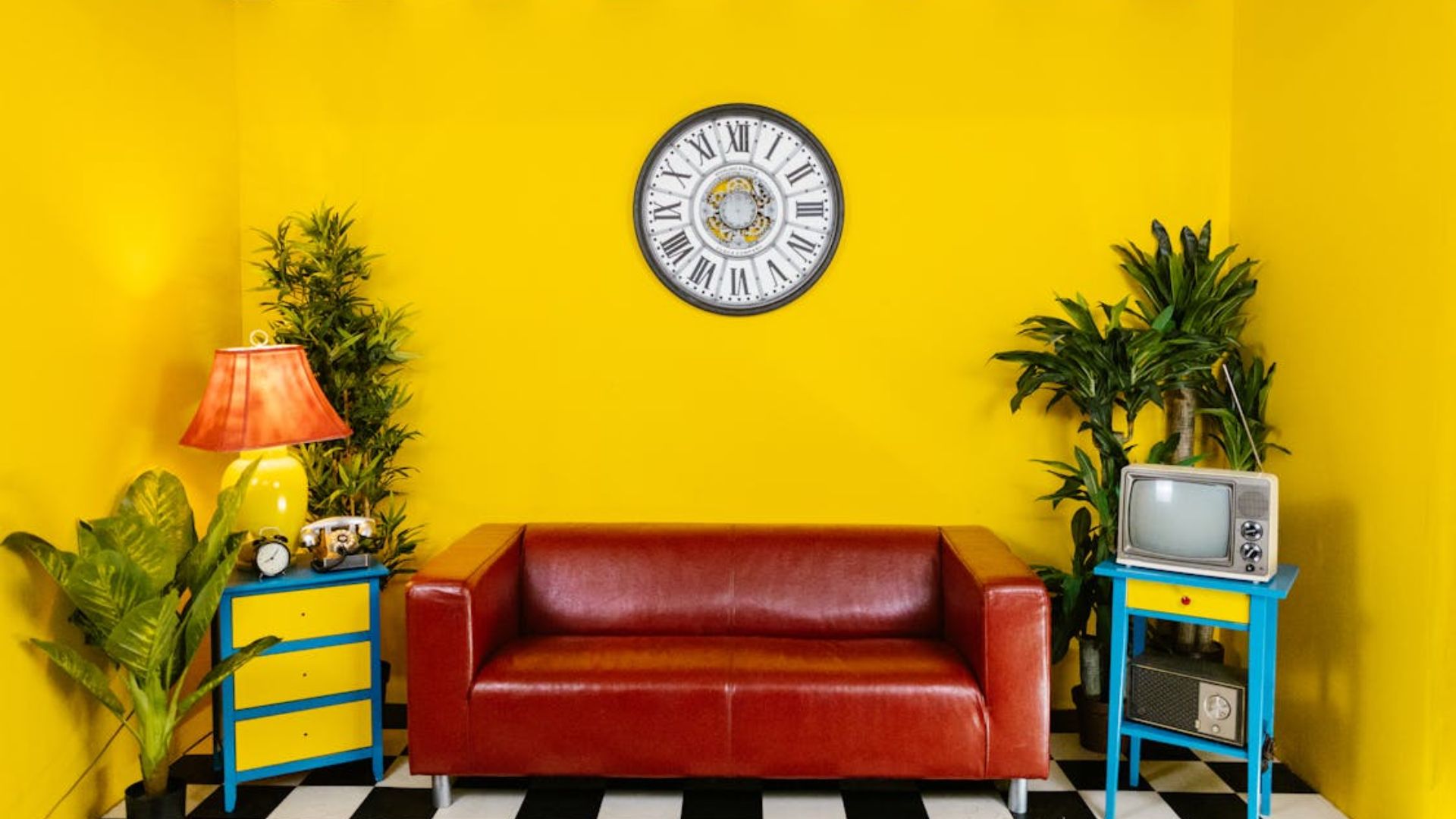
Rather than tiptoe, this pairing bursts into the room. Yellow alone brings high energy, but when hot pink joins the mix, things quickly become chaotic, and little room is left for subtlety or balance. Even with clever styling, the space often ends up feeling more exhausting than expressive.
Teal And Maroon

Teal, cool and vivid, feels worlds apart from the heaviness of maroon. They don’t share the same energy, nor do they build off each other. This combination may look like an interesting contrast, but it soon turns disjointed. The result is a palette that feels emotionally off and visually strained.
Brown And Electric Blue
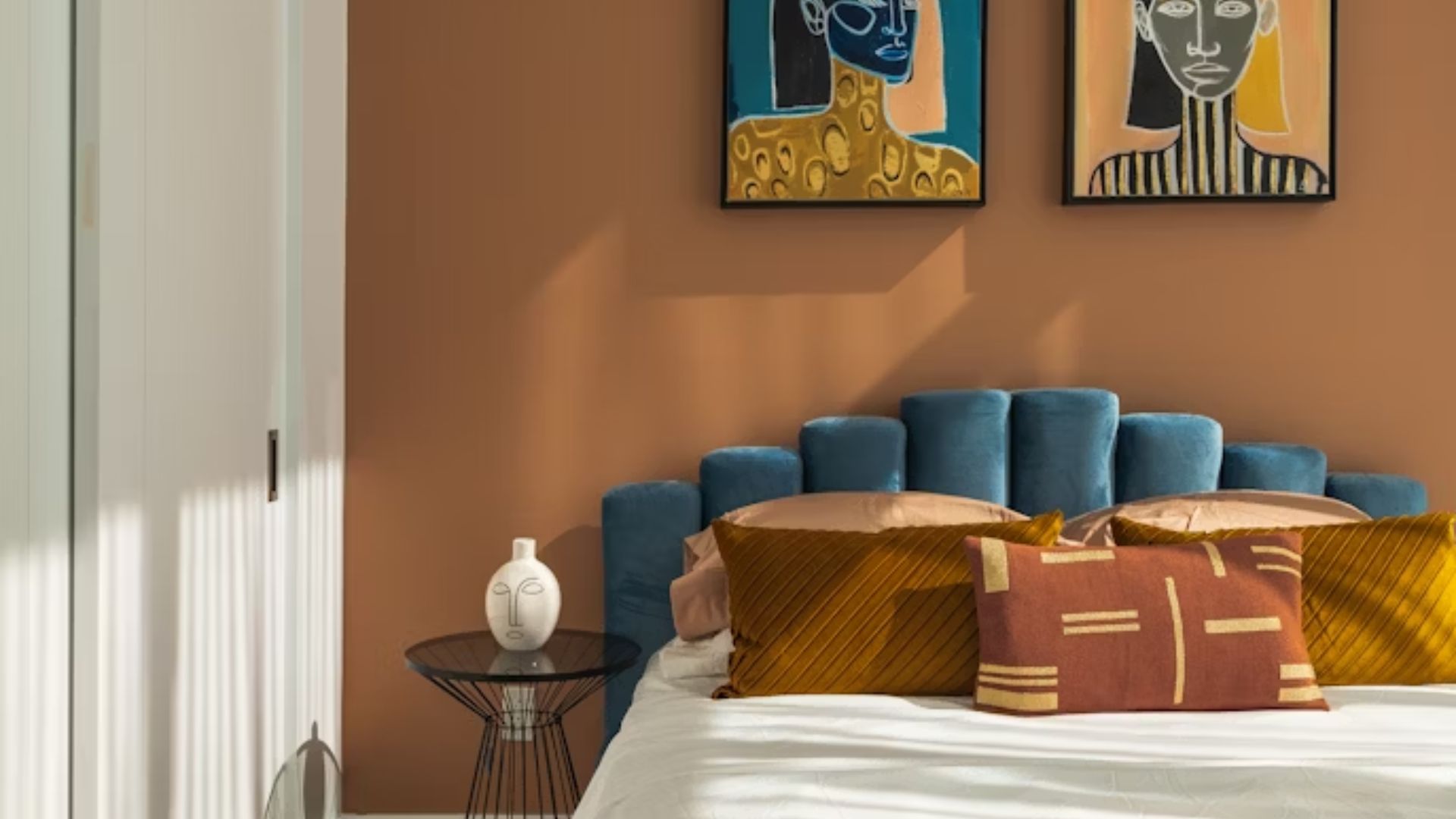
Though brown might aim for comfort, electric blue hijacks the mood with its intensity. Instead of enhancing the warmth, the blue feels out of place, too synthetic against an organic tone. Even when separated by neutrals, the clash lingers. Ultimately, the combination rarely feels cohesive.
Pastel Peach And Acid Yellow

Initially, pastel peach conveys a sense of softness and charm. However, acid yellow crashes in with a sharp, almost jarring brightness that drowns out the subtlety. The two pull in opposite directions—one whispering, the other shouting. This kind of imbalance makes it hard to find visual harmony.
